In this project, I have taken on the following roles:
- communication designer (interaction designer) (IxD)
- user experience designer (UX)
- user interface designer (UI)
- visual designer
- brand designer
Interaction design: high quality interactive prototypes and mockups for printing key tasks on computers, mobile devices and in advertising.
Branding:
- logo creation
- competitor analysis
- brand palette selection
- identity development
- visual concept development
UI/UX design:
- competitive analysis
- user surveys and individual interviews
- sitemap
- characters
- UI kit
- low fidelity mockups
- high-fidelity mockups and prototypes
- usability tests and conclusions
Duration: 3 weeks
Tools:
Tools:
- Figma
- Adobe Photoshop
- Adobe Illustrator
- Tilda
“сияние”
family dentistry center

family dentistry center “Сияние”
brief description
Development of a website and corporate identity for a Russian dental practice, which has successfully strengthened its position in the market of Rostov-on-Don.
Family Dentistry Center "Siyanie" is a small, cozy, private clinic in the city of Rostov-on-Don. Located in a residential area of the city, the Center has won the trust of many clients through individual approach and quality of services.
2022
problem description
The real challenge was that Siyaniye Family Dentistry Center was in a highly competitive market. In order to differentiate itself from other practices, it was necessary to develop a corporate identity and create a user-friendly website to attract the target audience with a customized branding strategy.
review
The website and branding for the Family Dentistry Center was developed from scratch. The clinic was founded by Marina Ermolenko, a dental therapist with over twenty years of experience in dentistry.
The dental practice needed to develop a complete branding package from logo to website. The task was to differentiate itself from other clinics in the already busy market of Rostov-on-Don, to work out an individual approach and combine the basics, for this purpose the following topics were outlined:
The dental practice needed to develop a complete branding package from logo to website. The task was to differentiate itself from other clinics in the already busy market of Rostov-on-Don, to work out an individual approach and combine the basics, for this purpose the following topics were outlined:
- customized website design layouts
- SEO-oriented web design
- branding that is vibrant, recognizable and echoing the UTP (unique selling proposition)
- A long-term strategy that integrates any future dental services.

- The dental practice market is quite busy and there is a need to differentiate yourself from others.
- There is little information about the clinic and staff online.
- Information with contact details and reviews of the dentistry is hard to find or does not exist.
- Show the uniqueness and increase recognition of the dental practice through branding development.
- Attract more patients to the practice through website development, good copywriting and SEO.
- Make it easy to write reviews about the practice, and make prioritized information available on the Intranet to increase loyalty.
I started my research with a competitive analysis to understand the approaches of other dental clinics. Also, having studied alternative solutions, I wanted to identify problems in the functionality and usability of the services.
User surveys helped me understand what information was most important when choosing a dental clinic so that I could prioritize.
Finally, I conducted 20 individual interviews, which helped me to uncover users' pathways to finding information and making an appointment, and to identify their pain points.
- When searching for a dentistry, it is difficult to find contact information, and there are difficulties in making an appointment.
- Important information, such as reviews of the clinic, is not always available, which makes the client hesitant to visit the dentist.
- It is important to show the advantages of going to a small private dentistry, where the attitude to patients is individual and trusting. As an advantage over large clinics, where treatment is "on the stream".
- The majority of respondents go to the dental clinic on the recommendation of acquaintances. Consequently, word of mouth greatly increases client loyalty.
It is important for the client to find a dentist, to easily make an appointment at a time that is convenient for them, where they will receive quality services as well as help for their individual case.
target audience identification
Identifying the target audience for the project is the most important part of the research. The image was developed by comparing quantitative and qualitative data from my user surveys and interviews with official demographic data. It will serve as an important reference point for future project decisions.


design basis
This sitemap is the result of my surveys, interviews and competitor research:
- When visiting the site, the patient first of all pays attention to the services provided by the clinic to solve their problem
- An important aspect is the location and working hours of the dental clinic.
- A decisive factor in choosing a clinic is the availability of qualified specialists, patient reviews and the quality of dental materials.

The user can also go to the service catalog section. After he selects the service he is interested in and fills out the appointment form, he will receive a confirmation that his data has been successfully sent and a clinic specialist will contact him shortly to clarify a convenient appointment time.
Finally, I added a widget to the homepage for ordering a callback to the user. I made this decision based on research that showed that a callback increases customer loyalty to find out all the necessary information about an appointment, and also increases the chances of an appointment at the clinic.
Finally, I added a widget to the homepage for ordering a callback to the user. I made this decision based on research that showed that a callback increases customer loyalty to find out all the necessary information about an appointment, and also increases the chances of an appointment at the clinic.
identification of important tasks
I decided to make a stream of tasks centered around the process of making an appointment for a service or a free consultation with a specialist. The customer indicated that he wanted an easy way to make an appointment with the clinic using a customer website.
For the user's convenience, the main page of the website has an "Make an appointment" button and a hyperlink to a free consultation to help them quickly contact the clinic and come in for a checkup.
For the user's convenience, the main page of the website has an "Make an appointment" button and a hyperlink to a free consultation to help them quickly contact the clinic and come in for a checkup.
User flow


design templates using quick sketching
In determining the organization of pages through outlines, I realized that the best way to go was with clearly organized blocks with ample space and intuitive design patterns specific to viewing information or moving between pages on the site.


Short sections highlight the main attributes of the clinic: experience of specialists, quality assurance and a team of professionals. On the main page of the site, the services provided, contacts and related products are also shown. These sections invite the user to book an appointment at the clinic using the CTA buttons.
Free consultation was another important requirement from the customer's side. To draw attention to this feature, I added a CTA button to the home screen. I highlighted this feature with a call back widget in the bottom right corner of the site, making it animated to draw attention to it among other navigation options.
Free consultation was another important requirement from the customer's side. To draw attention to this feature, I added a CTA button to the home screen. I highlighted this feature with a call back widget in the bottom right corner of the site, making it animated to draw attention to it among other navigation options.
information hierarchy design
I went from sketches to high-fidelity prototypes in grayscale. Working in black and white helped me identify problems with scale and information hierarchy.
I made sure that the history of the small dental practice was still an important feature and that the aspects of the business that set the practice apart from others, their ethical and sustainable practices, were emphasized.
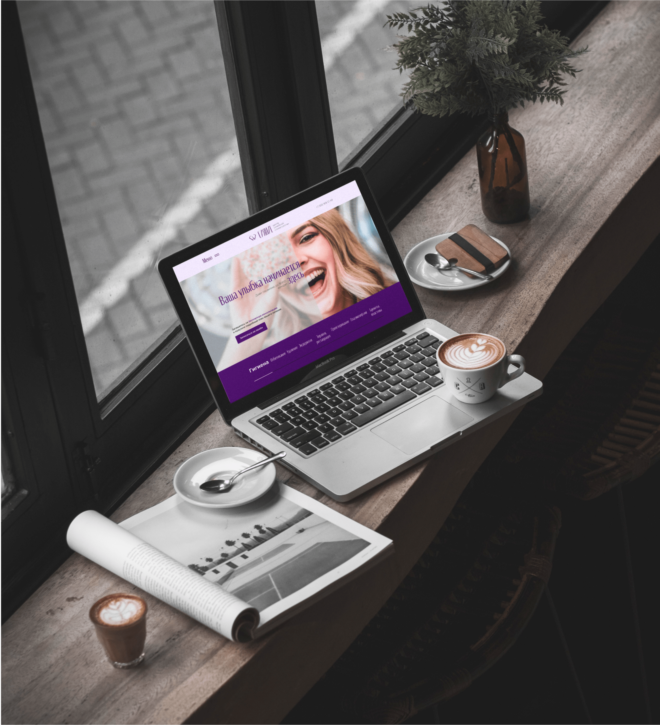
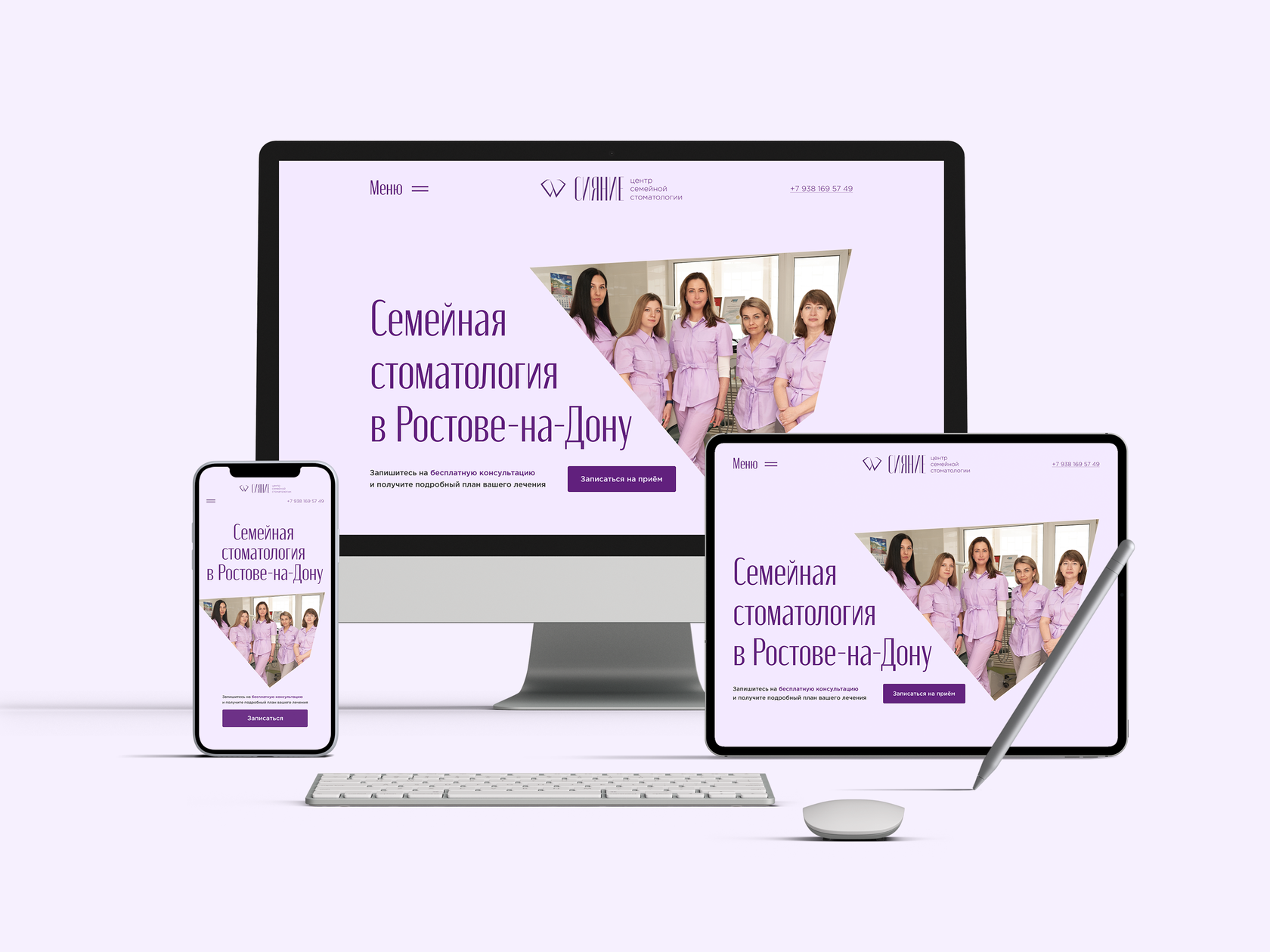
On the main screen, the user opens a photo of the friendly staff of the Siyaniye Family Dentistry Center that inspires trust in the client.


visual design refinement

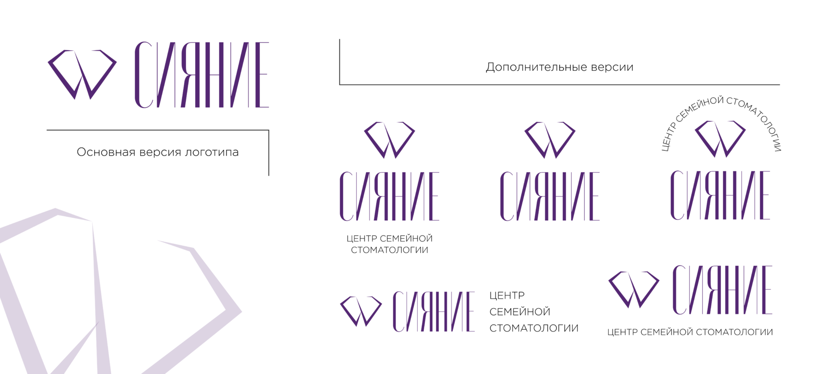
The graphic part of the logo shows an element that combines the image of a tooth and a diamond, which reflects the name of the dentistry "Сияние".
By combining these two elements, a unique graphic element has been created, which reflects the purity, shine and glamor of a healthy beautiful smile.
By combining these two elements, a unique graphic element has been created, which reflects the purity, shine and glamor of a healthy beautiful smile.

For the center of family dentistry "Сияние" was developed 7 versions of the logo (1 main and 6 additional), adapted for use by the customer in different situations.


color
Achromatic
During the development of the text part of the logo, different variants were considered. On the one hand, the font should be elegant and laconic, and on the other hand, it should be easy to read on both small and large media.
Moniqa font was chosen for the logo of the "Сияние" Family Dentistry Center, which perfectly combines the above characteristics.
Moniqa font was chosen for the logo of the "Сияние" Family Dentistry Center, which perfectly combines the above characteristics.

In addition to the font for the logo, fonts for the corporate identity and for the web were selected.
In the course of development, color combinations that perfectly complement each other were selected.
In the course of development, color combinations that perfectly complement each other were selected.

Corporate identity looks organically on different media, can also be realized in a variety of variations and combinations.
The logo and corporate identity are made in beautiful noble colors perfectly complementing each other. The developed branding reflects the company's core business, its value and key characteristics. It provides easy brand recognition, attracting attention, trust and distinction from competitors.


Four users out of ten noted that the gallery of specialist certificates is not intuitive and should be improved by adding navigation elements.
In addition, several users paid attention to the animated element with text. Since the monitor diagonal was small, it was impossible to fully read the text on the object until it disappeared. Consequently, the animation had to be replaced.
In the end, none of the participants found the color palette inappropriate.
The usability test showed that scrolling through the gallery is not intuitive, and also the animation in one of the blocks is not quite successful.
To solve these problems, navigation elements were added to the gallery section with certificates. Namely arrows indicating the possibility of scrolling through the photos. Next, the block of animation of the element with text was redesigned so that regardless of the diagonal of the user's monitor, all elements were visible and clearly readable.
understanding what works and what doesn't
High fidelity prototypes allowed me to test the key user tasks I identified in my research. A full application of the user interface showed that although the tasks were relatively simple, some elements required revision.
Using my prototype, I created a usability test to evaluate how successful my design was. The purpose of this test was to find out how user-friendly, intuitive, and accessible the design was.
I was particularly interested in examining the success of the appointment process and free consultation, as these were some of the most important aspects of my client's website.
The usability test confirmed most of my design decisions. Users had very few problems interacting with the site.
Questions...
After the participants completed the tests, I asked them to answer the following questions:
- How appropriate did you find the color palette?
- Were there any aspects of the design that you found difficult/annoying?
- Was there anything about the design that you liked?
- Please share any other comments you have (optional).
As soon as the user enters the website, he can familiarize himself with all the services available at the clinic. Each section has a detailed description and an "Make an appointment" button, which makes it easy to make an appointment.
Once the user has selected a service or made an appointment for a free consultation, they are taken to a page about the successful submission of data. This provides feedback to the user and it is possible to further familiarize with the promotions of the clinic and the rest of the list of services.
It is also possible to order a callback to the user. Studies show that this format of interaction with the client increases the likelihood of an appointment.
final design
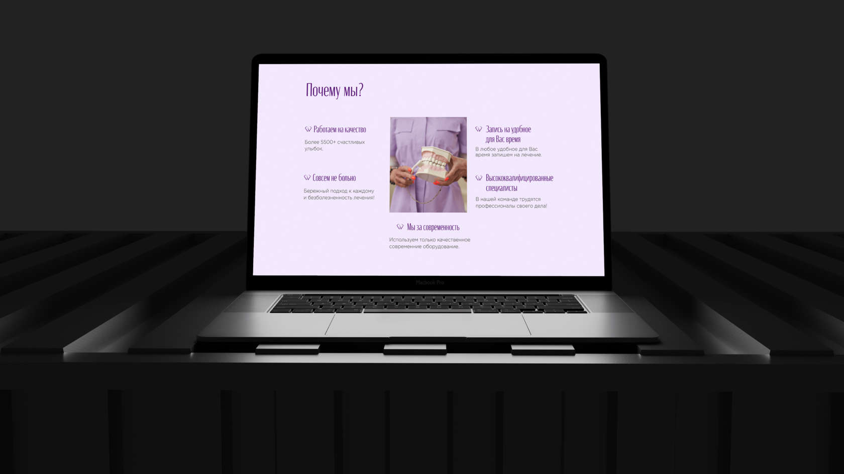
In the website and branding I developed for the "Сияние" Family Dentistry Center, I focused on the company's history and mission while emphasizing its modern approach to dentistry. The homepage highlights the company's key benefits, the expertise of its specialists, and its personalized approach. If users are interested in learning more, they can click on the "About Clinic" tab, which features a description of the dental practice, its history and team.
On the home screen and throughout the design, CTAs encourage users to make an appointment with the clinic: both for a free consultation and the services provided.
On the home screen and throughout the design, CTAs encourage users to make an appointment with the clinic: both for a free consultation and the services provided.
P. S.
Creating a website and branding for "Сияние" Family Dentistry Center taught me how to work with a small business client.
Before I started working on the design, I did a lot of preparatory work that included user experience research, analyzing user survey data, studying customer psychology, creating usability tests, and hypothesis testing for website performance and functionality.
My client had a limited budget and wanted to make sure they were making the best decisions for their company that would drive long-term success.
Several website builder platforms were researched and the best one for price and functionality was chosen. I wanted to make sure that the customer would not only get a great design, but also be able to easily edit and maintain their new site.


